Map: Most Common Country of Origin in Detroit

Alex B. Hill's avatarDETROITography

DETforeign_born

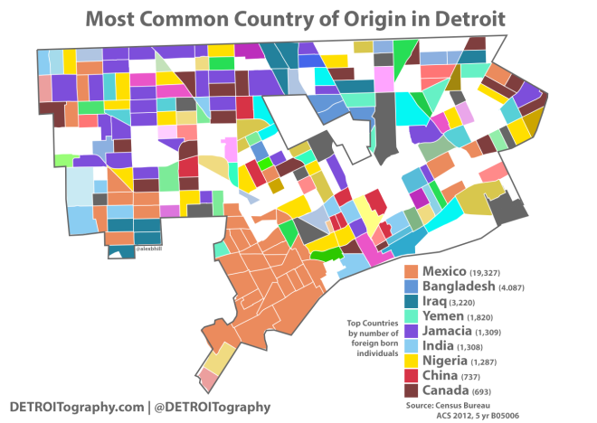
At first glance, this map is a mess to look. However, I made an artistic choice to keep all of the colors because I thought it gave a nice impression of Detroit as a colorful quilt of different countries, people, and backgrounds. The idea came from Slate‘s series of maps on “most common country of origin” by States. I pulled Census data for all census tracts within the City of Detroit and manually went through selecting the dominant country of origin (n=49) for each tract (n=323).

The dominant country of origin was by far Mexico with 19,327 residents across 40 census tracts. Bangladesh was represented by the second highest number of residents, but they were very concentrated in just 3 tracts. Jamacia came in second, dominating 29 tracts. Canada (19 tracts) and Nigeria (17 tracts) followed. Canada could also be found all across the city from Westside to Downtown to edges…

View original post 114 more words

Minimalist Map of the Detroit People Mover

Alex B. Hill's avatarDETROITography

peoplemoverminimal2

Image source

I came across this simplified Glasgow transit map and thought that would be an interesting idea to apply to Detroit’s ultra simple downtown “public transit” system. I choose some highlights of each station stop based on the station guides (no guarantees). The People Mover was constructed in 1987. Detroit was one of four cities selected to receive this “new” transit system as part of the “Downtown People Mover Program,” yet Detroit has one of the two remaining people movers from that program. Last year was the 25th anniversary of the Detroit People Mover.

EDIT: 12/03/13 Lafayette Coney Island added

View original post

Boulevard, Avenue, Road, and Street in Detroit

Alex B. Hill's avatarDETROITography

detroit_roads

Over the last three years working as a community health worker in Detroit, I have logged over 80,000 miles on my tiny car with the majority of those miles being from getting around Detroit to meet with clients, families, and community events. After a while I became really interested in street naming.

I first saw this street name mapping idea from Bill Rankin’s work in Vancouver to the Derek Watkins applying a similar effort to the Portland – Seattle area. I was finally given my last push and decided to create this map after following Bostonography. The piece that took the longest was finding a good file of Detroit streets (finally acquired one from my GIS professor this summer).

In order to understand the layout of Detroit “streets” you really have to know Detroit’s history. The different groupings of “street” names shows the development of Detroit and its…

View original post 583 more words

Detroit Infant Mortality Map 2009 – 2010

Alex B. Hill's avatarDETROITography

detinfantmortality

Infant mortality has been a persistent problem in Detroit that accompanies racial health disparities, low income, and environmental factors. This map compares infant mortality rates per 1000 to those of other countries around the world.

The Women Inspired Neighborhood Network (WINN), formerly Sew Up the Safety Net is a collaborative program with the major health systems in Detroit and has had incredible success in educating mothers and improving infant lives in a short time period.

See also: William Bunge’s infant mortality map 1969.

View original post

Detroit Transit Alternatives Map: Toward Public – Private Partnerships

Alex B. Hill's avatarDETROITography

det_alt_trans

I’ve been thinking about transportation in Detroit and how a number of alternatives to DDOT and public transit have been blossoming. Most recently I was surprised and excited by the University of Michigan (UM) launching a new, free shuttle service between its Ann Arbor campus and the UM Detroit Center in Midtown. The plan will also include shuttle routes to Eastern Market, Cultural Center, Southwest, and Downtown.

Most recently, the city has seen the development of The Detroit Bus Company which launched to “reinvent” how Southeastern Michigan gets around by offering rides to students to get to after school programs and helping suburbanites get into the city without a congested commute. Before there was the Detroit Bus Company, the College of Creative Studies was running a free shuttle for students around the city. A few years ago Wayne State University (WSU) teamed up with DMC and Henry Ford Health System…

View original post 364 more words

Map of the Week: Slave Populations in 1860

“Map showing the distribution of the slave population of the Southern states of the United States. Compiled from the census of 1860. Drawn by E. Hergesheimer. Engr. by Th. Leonhardt.” Library of Congress, American Memory Map Collections.

Thanks to Rebecca Onion at Slate Magazine for finding this map. This is an incredible visualization of our nation’s history and development of slavery as well as the political motivations of the Confederate southern states. This map could also give a nuanced visualization of the history of disenfranchised populations in the US and how that relates to present day disparities.

Map: Obesity and Corner Stores in Detroit

Alex B. Hill's avatarDETROITography

DETobese_final

The data on enrolled public high school students maps almost exactly with population density, but there is enough of a difference to make it worthwhile to examine the interactions between social and environmental factors. Corner stores (liquor stores, gas stations) were added to demonstrate the prevalence of these food locations in relation to obesity among students, however there is no significant correlation.

View original post

Map of Detroit Land Annexation 1806 – 1926

Alex B. Hill's avatarDETROITography

DETannex3

Source: Detroit Annexation and Land Expansion Map

It is much more interesting to look at Detroit’s land annexations in animated form. You can see how various areas of Detroit were added through the years. Looking at Detroit’s history you can see the slivered expansion northward from the River and then fanning out along the River’s edge, the city’s purchase of Belle Isle in 1879, the glory days of Grand Boulevard in 1891 when the city didn’t extend any further North, and the rapid land acquisition in the 1920s as the auto industry boomed and population swelled. Detroit’s industry, population, and services have changed drastically over the years, but the physical boundaries of the city have remained the same since 1926. Will borders be expanded further in the future to create a cohesive regional Detroit that includes the suburbs?

View original post

Map of the Week: People Killed in Cars Excel Map

1671469-slide-slide-5-a-brilliant-traffic-data-viz

This is an excellent map that was made all in Excel. This one shows weather related car deaths by regions (not sure what geographic unit) in the US. I’ve noticed a few projects now that really utilize the low cost Excel program for graphic design and mapping. The visualizations featured on FastCoDesign really caught my eye.

Full article and more infographic here.